Gradients are a powerful and visually engaging tool in CSS, and adding animation to them can transform static designs into dynamic, eye-catching elements. In this blog post, we’ll walk you through our entire exploration of creating an animated gradient border, explaining every step, test, and improvement—along with the reasoning behind our choices. We’ll also cover naming conventions like move-colors and flowing-colors in CSS animations.
1. Starting with a Static Gradient Border
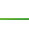
We began by adding a simple gradient bottom border to a div using the :before pseudo-element. Here’s the code:
div {
    display: block;
    height: 200px;
    width: 500px;
    border: solid 1px #CCC;
    border-bottom: none;
    position: relative;
}

div:before {
    content: "";
    background: linear-gradient(left, rgba(92, 7, 52, 1), rgba(12, 29, 84, 1));
    display: block;
    height: 5px;
    width: 100%;
    position: absolute;
    bottom: 0;
}
The :before pseudo-element provided styling independence, keeping the HTML structure semantic and uncluttered while allowing precise placement for the gradient border.
2. Adding Horizontal Gradient Movement
Next, we animated the gradient with left-to-right motion using the following code:
div:before {
    content: "";
    background: linear-gradient(90deg, rgba(92, 7, 52, 1), rgba(12, 29, 84, 1), rgba(92, 7, 52, 1));
    background-size: 200% 100%;
    display: block;
    height: 5px;
    width: 100%;
    position: absolute;
    bottom: 0;
    animation: move-colors 3s linear infinite;
}

@keyframes move-colors {
    0% {
        background-position: 0% 50%;
    }
    100% {
        background-position: 100% 50%;
    }
}
The name move-colors is developer-defined and connects the @keyframes animation to the animation property. Any valid name can be used as long as it is consistent across both places.
3. Introducing Flowing Colors
To give the border the appearance of flowing colors, we adjusted the gradient and animation as follows:
div:before {
    content: "";
    background: linear-gradient(270deg, rgba(92, 7, 52, 1), rgba(12, 29, 84, 1), rgba(92, 7, 52, 1));
    background-size: 400% 100%;
    display: block;
    height: 5px;
    width: 100%;
    position: absolute;
    bottom: 0;
    animation: flowing-colors 3s ease infinite;
}

@keyframes flowing-colors {
    0% {
        background-position: 0% 50%;
    }
    50% {
        background-position: 100% 50%;
    }
    100% {
        background-position: 0% 50%;
    }
}
The name flowing-colors also follows the same developer-defined naming pattern, and it controls the behavior defined in the corresponding @keyframes block.
4. Combining Flow and Movement
Finally, we merged both movement and flowing effects to achieve the ultimate gradient animation. Here’s the final solution:
div:before {
    content: "";
    background: linear-gradient(270deg, rgba(92, 7, 52, 1), rgba(12, 29, 84, 1), rgba(92, 7, 52, 1));
    background-size: 400% 100%;
    display: block;
    height: 5px;
    width: 100%;
    position: absolute;
    bottom: 0;
    animation: combined-animation 6s ease infinite;
}

@keyframes combined-animation {
    0% {
        background-position: 0% 50%;
    }
    25% {
        background-position: 50% 50%;
    }
    50% {
        background-position: 100% 50%;
    }
    75% {
        background-position: 50% 50%;
    }
    100% {
        background-position: 0% 50%;
    }
}
Complete Code of Animated Gradient Border
Here is the complete code with a basic example html.
<!DOCTYPE html>
<html lang="en">
<head>
    <meta charset="UTF-8">
    <meta name="viewport" content="width=device-width, initial-scale=1.0">
    <title>Combined Gradient Animation</title>
    <style>
        .myDiv {
            display: block;
            height: 400px;
            width: 100%;
            border-bottom: none;
            position: relative;
        }

        .myDiv:before {
            content: "";
            background: linear-gradient(270deg, blue, green, yellow);
            background-size: 400% 100%;
            display: block;
            height: 25px;
            width: 100%;
            position: absolute;
            bottom: 0;
            animation: combined-animation 6s ease infinite;
        }

        @keyframes combined-animation {
            0% {
                background-position: 0% 50%;
            }
            25% {
                background-position: 50% 50%;
            }
            50% {
                background-position: 100% 50%;
            }
            75% {
                background-position: 50% 50%;
            }
            100% {
                background-position: 0% 50%;
            }
        }
    </style>
</head>
<body>
    <div class="myDiv"></div>
</body>
</html>
Conclusion
Through this process, we explored how to create animated gradient borders in CSS, from static designs to dynamic animations. By leveraging :before pseudo-elements and custom-defined animations like move-colors and flowing-colors, you can achieve captivating visual effects.
We hope this guide inspires you to experiment with gradients and animations in your projects. Happy coding!


Leave a Reply